How we redesigned our mobile apps without anyone noticing
When I joined the company, the Kiwi.com apps were not in good shape. It wasn't bad, but it wasn't particularly great either. From a design perspective, we had four different styles of inputs, not 50 but like 150 shades of grey, and the visual language of the app was everything but consistent. It was painful to design for and even harder to develop and maintain. We knew we had to do something about it.
One of my first assignments was to go through the whole app and screenshot the hell out of it. Mainly to identify all the problematic user flows and UX fails that have accumulated over the years. We also did a bit of qualitative testing with our developers. They were the ones working on the app for quite some time, meaning they had a ton of interesting insights.
Once we've gathered all the feedback and data from analytics, we had a pretty decent idea where we want to go with the app. But before we get into that, let me sidestep for a minute.
Familiar by design
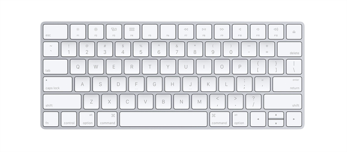
You most likely know this device, right? If you are not familiar with this particular model, don't worry. By the layout of the buttons, the labels on them, the shape of the device, it is pretty safe to say that this is indeed a keyboard. You are most likely used to type on something like this.
Now imagine, that at the next WWDC, or one of the other keynotes, Apple would present something like this.

They would present it as something revolutionary. The one of a kind, on the go, keyboard experience. Something that has gone through countless iterations, design reviews, and prototypes, and it is reaching the very top of its awesomity. It is that good. And it will be the Apple experience from now on.
But even if all of that would be true, it would not most likely not succeed. Trying to change the habits of people that are in place for years is an enormous undertaking and a hard sell.
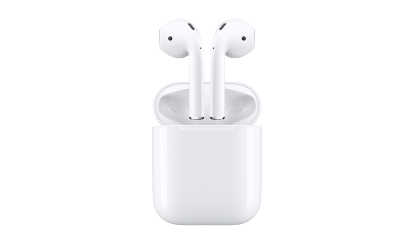
Let's compare it to another Apple product, AirPods. They were a massive revolution from the industry perspective, but they were a small evolution in the eyes of its users. If we would oversimplify it, we could say that all Apple did was cutting off the cords, and putting what was left into a small box that you occasionally need to charge. The inconvenience of charging was far lower than the benefit of not having to worry about cables. In the end, this product was improving the experience of doing your habit. And it is a huge success.
Let's turn back to software for a bit. You guys know Reddit, right? They introduced a new redesign a while back. While it wasn't a big redesign, it was different enough. It wasn't bad, Reddit needed a visual polish for a long time now. The problem was that it came as a sudden revolution, and not as an evolution. And people don't like revolutions, especially not in products they use daily. So they got vocal!
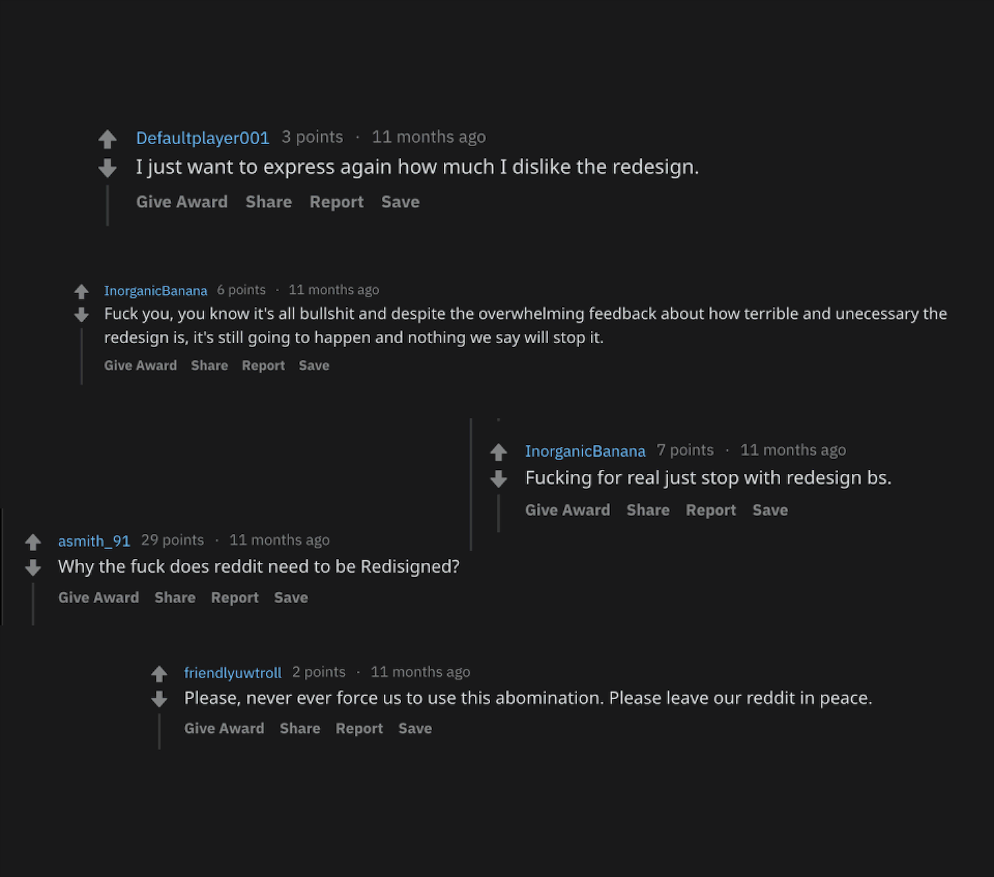
And that is good! These people genuinely care for Reddit. They might not be using the best words for it, but you can't blame them really. Reddit is their daily bread; it is part of their routines; they rely on it to let the steam off, chill, and connect with their communities. So forcing a redesign on them is putting them into a stressful situation where they need to adapt, make mistakes, and learn. And some people just don't feel like doing it, or it isn't coming at the right time.
Now, Kiwi.com is working in a very stressful business already. People on the road are always under stress. They travel in an unfamiliar environment, around people they don't know, to an event they might be very important for them and they need to get there. On. Time. And they rely on our mobile apps to help them achieve that.
They might get to a situation when they are about to leave, just to realize that the whole itinerary detail where they saw the boarding pass before is now completely redesigned. And they would have no idea where to find it. They might eventually manage to navigate to it, but it wasn't something they needed on that day. Unfortunately, Kiwi.com customers will never be in a position where they'll all chill for a week while they learn how the new redesign works. Thus no matter what, our apps should always feel familiar, even if they are undergoing more significant changes.
So, again, how did we manage to redesign our apps? But without anyone noticing that it was happening?
We redesigned it the same way we built our design system
Basically, as we were defining our DS, we were redesigning our mobile apps. We started with colors, once we had colors we were able to set our typography. Once we had both of these, we created atomic components and the core of Orbit for mobile. And eventually, we used these components to redesign layouts, and later the whole flows.
Colors
Defining colors seemed reasonably easy. Not as easy as it should be! Imagine ten designers in one room, discussing whether the brand green color should also be a success status color as well. But thanks to Honza Toman and his work. Incorporating the new colors was a breeze.
Figma source file for our colors
This basic set served us well over a year before we started making small additions and adjustments to it. Once we applied the colors, it looked something like this:
We were quite afraid because this felt like a quiet an impactful change already, but to our surprise, nothing happened → nobody noticed. We didn't get any comments about the new colors. No new reviews because of that. People either didn't care or it was just a too subtle change for them. Good!
Typography
Since the first update went well, we were ready to tackle the typography and icons next. We wanted to unify typography since it was different on all platforms. Be it mobile apps, our web app, and print. We gather preferences from our team, explored the options (our product is global, because of that we need huge support for diacritics), and went with Circular. We liked the feel of it, it has a very good international support, and we thought it goes well with our brand.
But in the end, defining the typography styles themselves was reasonably easy as well:
Figma source file for typography
We've figured out we didn't need anything crazy. Set of 4 title styles plus three sizes for copy and three sizes for their widths was just enough. It covers our every need.
On iOS, the change itself was almost invisible for most people. Even for some of our developers. Though on Android, the move was a bit more prominent. But again, no strong feelings coming from our users. None at all!
Components
This is where we could express our creativity a little bit more. The shit got real! We started updating our components 🎉 I deliberately didn't write redesigning. We were aiming to keep the same amount of information and relatively similar information architecture. But we wanted to make the visuals a bit more consistent, and finally, give them some additional flavor with illustrations.
Some screens were affected more than the others, but none of them were changed dramatically. It was also the time when we started defining components for Mobile Orbit. We've created all the atomic components like buttons, switches, segmented controls, tooltips, and many others. It was a massive step for refactoring our UI. If you would like to get your hands dirty, I wrote an article how we handle our design system with Figma, and how we do versioning.
Layouts
And finally, when we had most of the stuff set up, we could do something about our user flows and layouts. At this point, we were sure that our customers are used to our design language and can navigate it. We had lots of data of the general usage patterns, so when we started changing the user flows, we had a clear vision of how to do that.
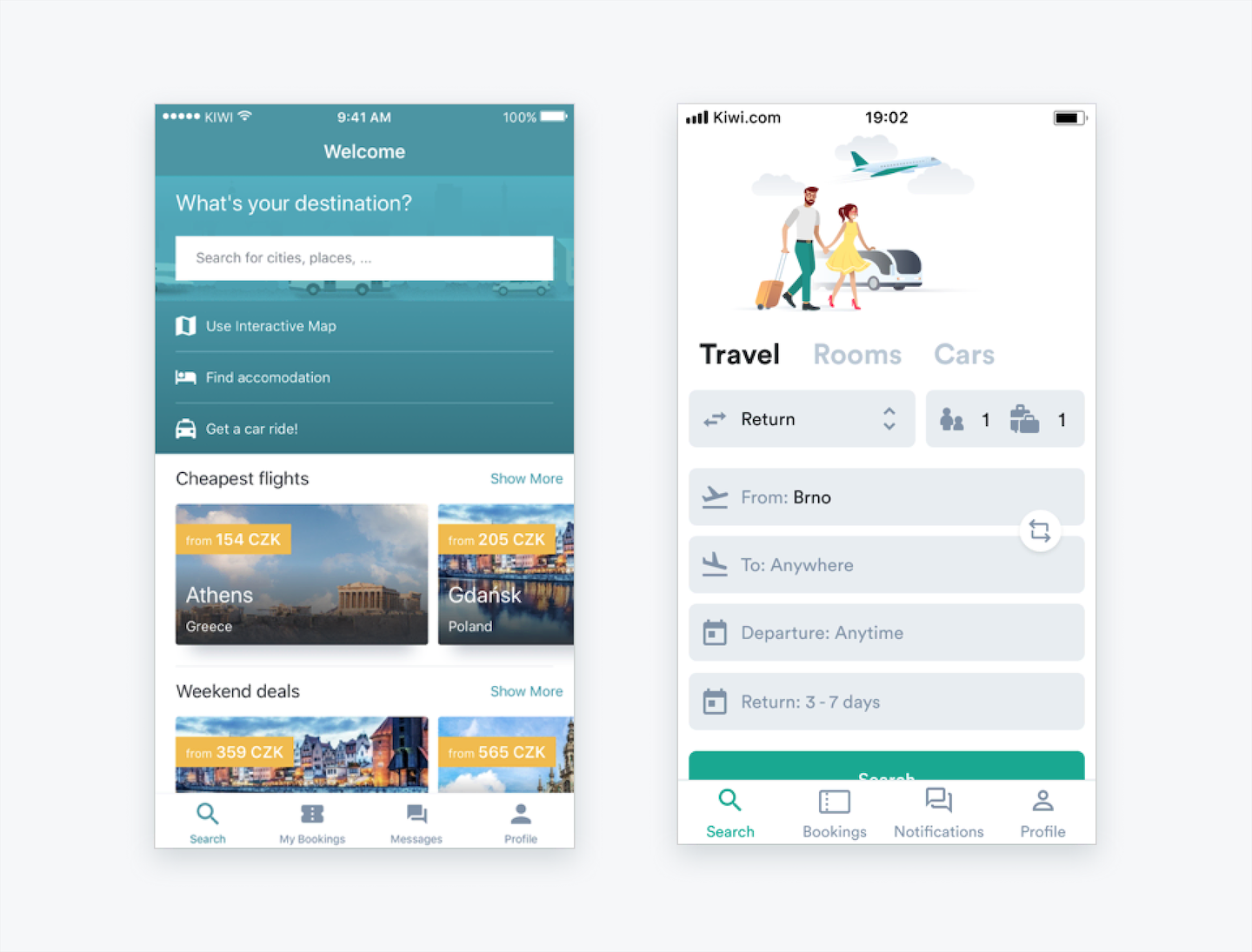
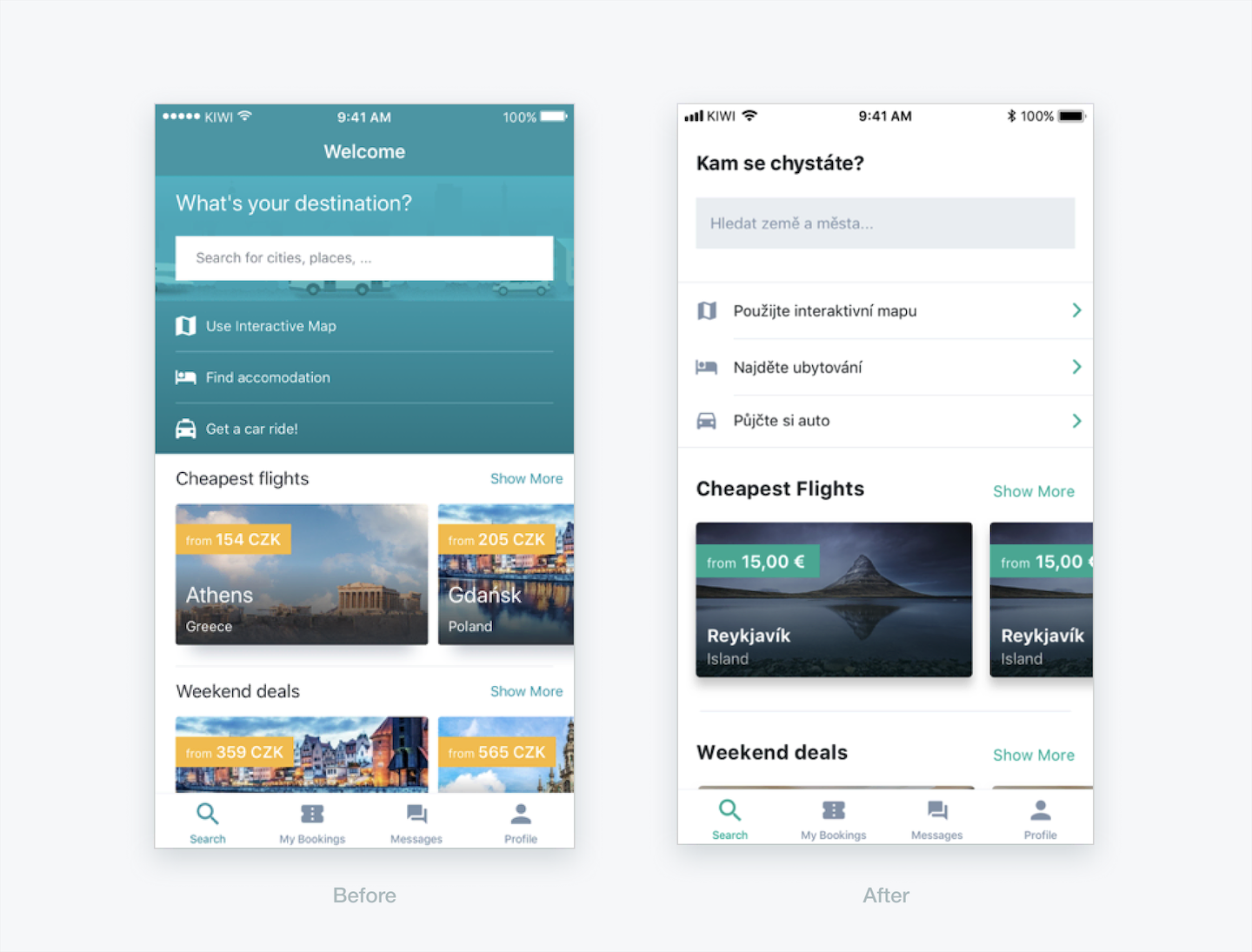
For example, on this screen, we knew that the content below the search input wasn't performing that much. Only the minority of our users were taking advantage of that feature. And at the same time, the search flow via only one input form was confusing to most of the people, so we've made it more straightforward and easier to use (yeah 🤯). And once we tested it out in the wild, we've verified that our assumptions were correct.
So finally, once we were done with the initial phase of our redesign, people finally started noticing, and they liked it a lot!
