How we handle Kiwi.com's design system with Figma
The mobile design team at Kiwi.com is tiny, there are only two of us. But there are around twenty people contributing to our designs in some way. Whether they’re commenting on our latest iterations, fixing copy, or designing cross platform features. Currently, our front end is designed in Sketch, as is Orbit, our design system. But since the mobile part of Orbit is visually different, we decided to try designing it in Figma and see how it works for us.
- Why we built our mobile design system in Figma
- How the latest update changed the way we work
- How we’ve designed our design system (with examples)
Why Figma?
A Sketch-oriented workflow relies on tools like Zeplin to handle handoffs, Abstract to cover version control, and Marvel to design static prototypes. But, from time to time, things get out of sync. Prototypes get stuck on the latest tested iterations, people forget to push commits to Abstract, maybe Zeplin hasn’t been updated with the latest approved visuals, or the PNGs embedded in Dropbox Paper are 3 weeks old. These tools are, by design, bound to get out of sync 🤔
Before I joined Kiwi.com, I was playing with the idea of trying Figma, but it was hard for me to get to it. I didn’t see much much value in using it, and the need to keep all the tools in sync just wasn’t there.
never! :D I would rather move to iPad than a browser.
— Denis Rojčyk (@rojcyk) October 19, 2017
I was also put off by the browser/cloud approach to it. I liked that I could fire up Sketch whenever I wanted, and it’s a native mac app. And then it hit me, there’s no way around it—you either have everything in the cloud and it’s in sync 100% of the time, or you have things offline in desynchronized workflows. So, I tried working with Figma, just a little bit at first, and I liked it a lot.
Then I joined Kiwi.com last November. Vojta Rysanek was the only one working there on mobile at the time. He was covering all the platforms and all the devices by himself 👏. While he was doing a great job, his work lacked a consistent system behind it.
You will eat your own words in a ~year 😆
— r0b.eth⚡️ (@robinraszka) October 19, 2017
We wanted to try it, but betting on Figma without the whole team, and designing Orbit in it, seemed like a bad call. It wasn’t very clear what direction the Figma team would be heading in, and what they would focus on. Additionally, some of the features just weren’t quite ready. And yet, we decided to try it anyways, but with mobile only. Our front end and Orbit are still designed and maintained in Sketch.
Figma 3.0
Until recently, managing components was a pain. It lacked the features to make the design system scalable. If you wanted to work with a DS efficiently, you were limited to a single file.
Fortunately Figma introduced a huge 3.0 update. I won’t go into much detail here (just follow the link), but basically the update:
- Made enabling, disabling, and managing updates easy
- Enabled users to share components with overrides across files
- Enabled users to share different styles for layers (which makes it more atomic than Sketch, as it enables you to combine text styles with colors and effects).
Our Design Library Component Principles
Whenever we design a new library component, or any other addition to the design system, we try to follow a couple of UX principles. Which should ensure the library remains consistent, efficient, and easy to work with.
Max two level deep logic
Working with components and nesting them seems pretty powerful at first. Buwt as you know, with great power comes great responsibility. It’s very easy to go overboard and over engineer your design system. I’ve found that going about 2 levels deep provides the best balance of usability and possibility.
Think about the hit box
The term hit box comes from FPS games, it is an area which you need to hit, in order to do damage to your opponents. In our case, it is an area you need to double click, in order to edit or select the layer. Sometimes ordering the layers is enough, other times you might need to make things bigger. Either way you need to make it easy to work with :)
Component override logic
Component override suggestions are based on the size of the components. So, when you want to replace a component with something else, and you want to select it from the suggestions window, it needs to be the same size.
Helpers library
It really helps to define a separate file, which contains all the small things which we use to structure the design files. We’ve created a file called Helpers. It helps to distinguish components visually and gives your canvas a sense of structure. We do this because we share these files with everyone in the company, even with non-designers, and they often need some visual helpers to navigate the documents.
GroupIt ProTip
We wrap all of our components in groups. This way they don’t clutter the sidebar in the file components library. This makes working with page with lots of components far easier. This is something I miss in Sketch quite a lot.
Optimise Bitmap Assets
When working with photos or any other bitmaps in our designs, we work with them as we would if they would be web assets.
- We optimise the images: with tools like ImageOptim, Optimage, tinyPNG and such. I’m not sure, if Figma does any optimisation, but we do it anyways.
- We optimise the file format: PNGs for simple illustrations and JPEGs for photos.
- We resize the assets: We generally don’t need a billboard sized photos in our mockups.
Following this practice improves the download time of our files and library components. It also makes reopening files less of a hassle.
Components and project structure
I’ve recreated the following examples so you can easily use them yourself. Just copy them, and feel free to adapt them to your workflow.
Project file structure
One file per project or flow. We have files like place picker, date picker, search and similar. But this also has its own problems, since you cannot connect two files and create a prototype from them. But still, this is the best solution management wise.
Project versioning
We use pages as different versions of the project with a standard X.Y naming convention. X represents huge version updates, while Y smaller iterations. With the latest iteration on top. And components page, hosting component candidates which we consider moving to the main UI library.
Project cover
It might seem like a little thing, but navigating through Figma can be a pain when you have lots of files and projects. File titles work, but it is hard to scan them fast. That is why we use cover images.
If you have only one frame in @figmadesign file first page, and you set the frame size to approx 1240x660 (or the same ratio), you can use it as a file cover. Helps with the file organisation a bit. pic.twitter.com/w1CWxNXxAt
— Denis Rojčyk (@rojcyk) February 12, 2018
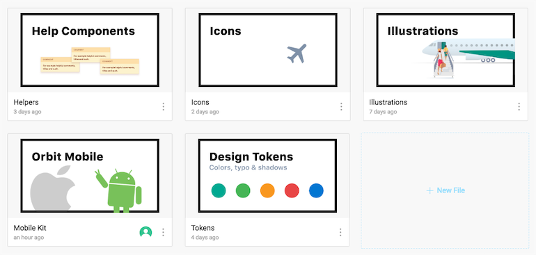
Global Libraries
Only the mobile team is using Figma at the moment, but that might change in the future. So we had to set up the files in a way which supports both mobile and front end libraries.
Helpers
I mentioned this a bit earlier. It only has a couple components which are used to help our team structure and navigate files. We use Page, category, and section to distinguish between different components, comments are there for anyone not using Figma directly, and the color sample is for our token library.
Tokens
This file is rarely touched. It contains the most atomic components of the entire design system. The file has three pages: colors, typography, and shadows. Basically everything you can define in Figma Libraries, except for components.
Colors
This file is very rarely touched. We’ve already defined the colors we use.
Typography
Typography is the same as colors. We’ve already defined everything we need in our design system (it is missing some FE font style definitions), and thus is rarely touched. The typography defined above seems rather simple, but when combined with other shared styles, it’s everything we need on mobile.
Shadows
Shadows are something we’re still experimenting with, but so far we’ve defined 4 elevation levels, and this seems to work well for us.
Icons
Icons have their own page, they are all split into different sections, and are placed in 24x24 frames. Almost all the icons are standard Material Design Icons.
Illustrations
Illustrations are very similar to icons. It’s just a huge canvas full of our product illustrations. They all share the same size. But due to some import limitations of SVG to Figma, we have to work with bitmaps for now.
Orbit Mobile
Initially we had two different mobile libraries for iOS and Android. But since they overlap a lot, we’ve decided to combine them. It’s easier for us to maintain it this way. But differences in the presentation of some of the UI elements still remain, for example switches and such. This is still a work in progress, and we need to catch up with Android a little bit 🙂
Conclusion
I ate my own words, as was predicted 😅
— Denis Rojčyk (@rojcyk) July 19, 2018
While Figma lacked in features before the 3.0 release, most of my must-haves have been added, and it became a serious competitor to other tools. Building a design system with it proved to be relatively easy. Actually I feel like managing it in Figma is far easier than in other tools. It is by no means perfect, but it fits my taste the most.
The way we structure our files and split the design system logic is constantly evolving with every update, but the things mentioned in this post have stuck with us the longest and proven really effective.